
Measuring security for cloud native applications

Modern cloud-native applications – and the DevSecOps culture and practices used to manage them – introduce a fresh layer of challenges to the already thorny topic of security measurement.
Historically, security has been typically measured on a regular but intermittent basis, at particular points in time. However, the pace of change at modern, cloud-native organisations, who've implemented DevSecOps and/or CI/CD, is relentless. Many deployments might be made in a single day, and the security posture of businesses might thus change dramatically over that time. Security measurements taken at a particular point in time are therefore of ephemeral relevance. "These environments are too dynamic now," says Alyssa Miller, BISO at a large financial ratings agency, "I can't sit here and say I'm going to run [a test] every 90 days and expect that's going to tell me meaningful information."
Metric deception
In addition, the measurements used to judge security are sometimes deceptive. One example of this would be the total number of open vulnerabilities in teams' applications or designated parts of an application. This seems like a sensible, objective measure of application security, but isn't always helpful. For example, one team might report 400 open vulnerabilities in their application, while a neighbouring team might report just 20 vulnerabilities in their own project. Which team is doing the better job? To an uninformed eye, it would be easy to imagine that the second team is outperforming the first on security. But that might not be remotely true. The difficulty here is that the first team might actually be much more thorough in its testing than the second. Discovering 400 vulnerabilities, as opposed to 20, may well mean they're performing more effectively.
A second complication we might add to the scenario above is that not all vulnerabilities are equal. For example, suppose those 400 vulnerabilities are all low-level, meaning that even if they were exploited, criminals wouldn't gain access to any private data. Meanwhile, let's also suppose the 20 vulnerabilities reported by the other team are all high-level - and if any of those were exploited, it could pose a severe problem for the business, then the apparent story told by the raw figures is the opposite of what that business's leaders need to know from their security measurements. In terms of what's critical, addressing high-level vulnerabilities must be weighted much more highly than those of a more superficial nature.
A further useful metric is the time taken to remediate vulnerabilities. This can be attractive because it's a measure of the work put in by teams. But once again, caution should be exercised in its use. Some vulnerabilities allow a very quick fix - updating to the latest version of a package, perhaps - which some security tools can implement at the click of a button. Others might require much more work – re-engineering a feature to create a solution that doesn't rely upon a particular library, for example. So while one developer might fix 20 vulnerabilities in a single morning, another might have fixed one - but that second developer had to work much harder and more creatively. Once again, understanding the full story and the context behind the figures is required.
In summary: first of all, security measurement needs to be a continual process - because 'point-in-time' measurements lose their accuracy so quickly. Second, single, simplified measures are often misleading: a rise or fall in a single measure may be positive or negative depending on the other metrics to which it is related.
At the same time, though, senior management need a reliable and digestible insight into the safety posture of the organisation's applications. This empowers them to make data-driven decisions, to recognise high performance and to understand where more investment might be required.
Making measurements real
To cope with the dynamic pace of modern software development, real-time data visualisations need to replace the idea of snapshot scores. Teams need to be able to supply a range of metrics and understand the relationship between those figures: the proportion of low-level vulnerabilities, for example, will impact the proportion of high-level issues, and probably also the total number. The organisation's inventory of security measurements will include each of these figures, along with the average time to remediation, input from SAST and DAST tools, the number of commits and other sources.
The next step is to understand the relationships between these figures, and to eliminate duplications: if you already have the number of low and high level vulnerabilities, for example, then a separate measurement for the total number of vulnerabilities isn't adding value, and may actually obfuscate the necessary detail for understanding.
Visualising the flow
Attempt to plot the relationships between figures using a tool such as causal loop diagramming. These are ideal for this purpose for two reasons. First, causal loop diagrams don't stress a linear, one-way cause and effect situation but instead allow us to visualise the continuous and dynamic nature of the information we're trying to represent. In the case of security metrics we need to represent how changes in the data elements over time will impact each other. Second, causal loop diagrams are meant to never be finished. You can easily add new nodes and loops, ideal considering that new data elements from new cloud native technologies will arise over time.
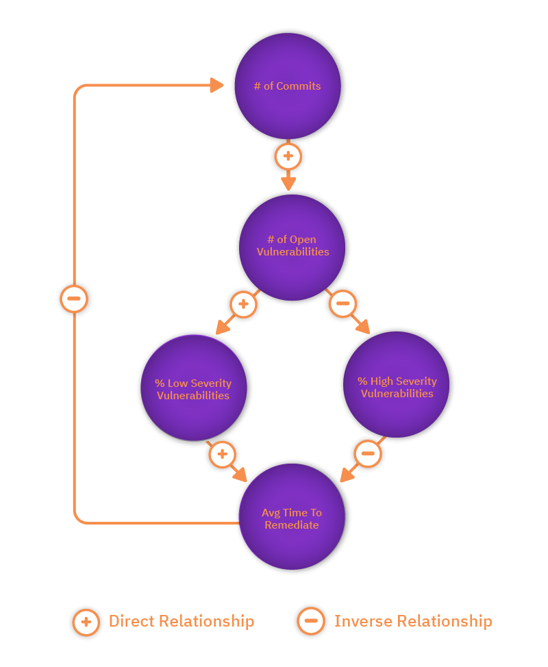
Having mapped all of your inputs, it should become easier to see the most useful measures. Work out where there are duplicates and then look for nodes in your diagram that have only incoming causal relationships but no, or maybe only one, outgoing causation. This is a strong indicator that what you've found is a top-level data element. For instance, application risk might be one of your nodes. But application risk doesn't impact the quantified data elements; it's a correlation of the various data relationships. Therefore, that can be a meaningful top-level metric, if we can successfully quantify it. The next stage is to weight the value of those most important elements to move towards an overall score that might be visualised as a trend line. Unfortunately, there's no one-size-fits-all formula to copy here: every organisation is different in the terms of its risk appetite, environmental makeup and overall approach to their security programmes – but hopefully this article helps with some pointers towards that. (There's more detailed information on constructing these diagrams in this white paper on security measurement).
It's the trend, not the numbers
Having created this measurement, it's key that managers and team leads understand the components of scores, as the complexity and the full story will be required to explain anomalies and understand how new components may be best added to the picture.
Finally, it's important to realise that what matters is not reaching a particular score (or remaining beneath one), but rather that security is an ongoing process - the real measure is to achieve better results over time and to ensure scores keep moving in the right direction. There's no end point or 'good-enough' score. As Alyssa Miller notes: "No developer is going to put their hand up and say: 'yep - the application is now fully secure'. You're constantly working to get more and more secure because the threat landscape is always changing."